A refreshed look for the human resources site for an established university, solidifying their new branding guidelines
A refreshed look for the human resources site for an established university, solidifying their new branding guidelines


Web
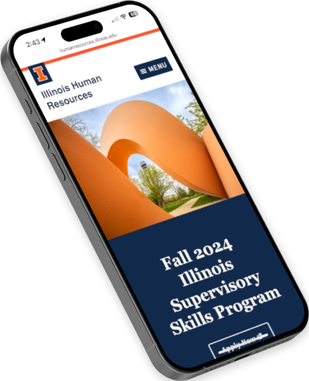
The University of Illinois at Urbana-Champaign’s Human Resources department sought a modern, user-friendly web experience to better serve its faculty and staff. Partnering with Clanin Creative, we embarked on a mission to develop a fully custom website that not only meets their functional needs but also showcases the University’s refreshed brand guidelines. Through a collaborative and data-driven process, we crafted a digital experience that aligns with the University’s vision and enhances user engagement.


Logo Development | Environmental Branding | Merch
An identity inspired by traditional Italian design, the Clanin team partnered with Martinelli’s Market Bakery & Deli to create a brand that lives beyond just a website.
From brand messaging development to environmental graphics, everything was designed to offer a beautiful experience that emphasizes family legacies, old-world bread making traditions, and time-honored simple ingredients.
Laying the Foundation
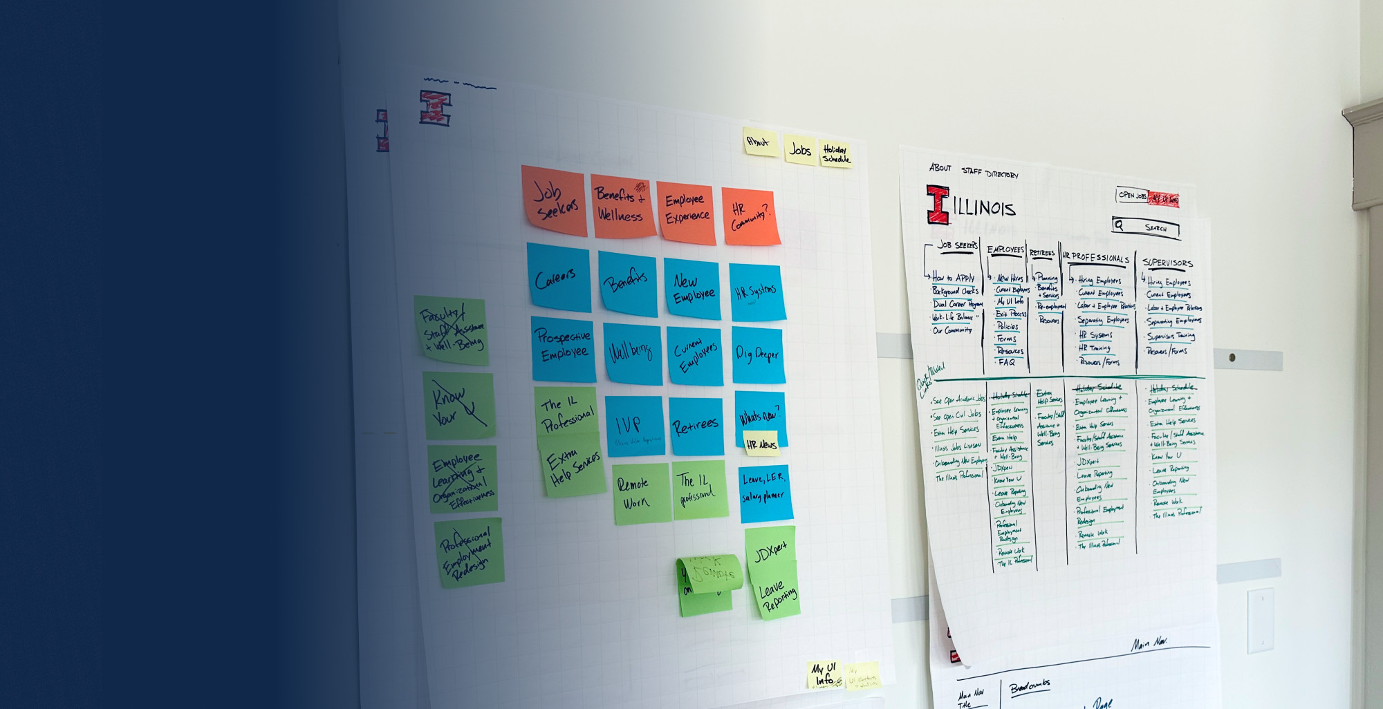
In a highly interactive sitemap meeting, we collaborated closely with the University of Illinois Human Resources team to map out the primary navigation titles, drop-down pages, and overall user flow.
Through interactive brainstorming and planning, we visualized and organized the website structure, ensuring it catered to the needs of all users. By evaluating existing Google Analytics metrics, we made informed decisions that enhanced the website’s functionality and accessibility.

Applying
The Brand
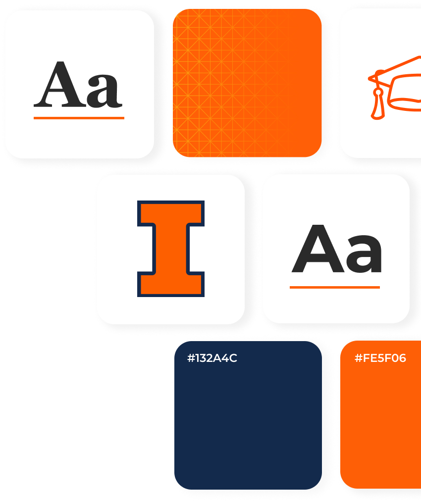
By carefully integrating the University of Illinois’s updated brand guidelines, we ensured consistency in fonts, colors, and new patterns. This new site marked one of the earliest adoptions of the University’s latest branding standards on campus, setting a new benchmark for future web projects.


Applying The Brand
By carefully integrating the University of Illinois’s updated brand guidelines, we ensured consistency in fonts, colors, and new patterns. This new site marked one of the earliest adoptions of the University’s latest branding standards on campus, setting a new benchmark for future web projects.
