Elevating the brand of a nationally celebrated goat farm as it expands into a hospitality destination
Elevating the brand of a nationally celebrated goat farm as it expands into a hospitality destination



Logo and Brand Development | Signage | Food Packaging
We’ve loved continuing our partnership with the owners of Prairie Fruits Farm and their sister businesses—Martinelli’s, Pekara, and Central Illinois Bakehouse. Our latest collaboration dives into an updated identity for Prairie Fruits Farm.
After reimagining their identity, our team jumped into creating everything they needed for their expanding farm. From cheese packaging to a sub-brand for their new restaurant, we focused on crafting a cohesive look that stands out no matter where you find it.
Reimagining
The Goat
Reimagining
The Goat
The first challenge in the rebrand was reimagining the iconic goat logo to better reflect the farm’s evolving identity. The new design brings warmth and personality to the goat, reflecting the farm’s transformation into a more inviting, guest-focused destination.
Behind the Brand
Behind the Brand
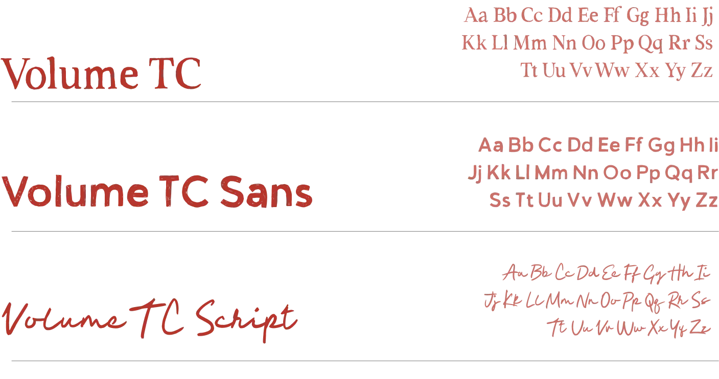
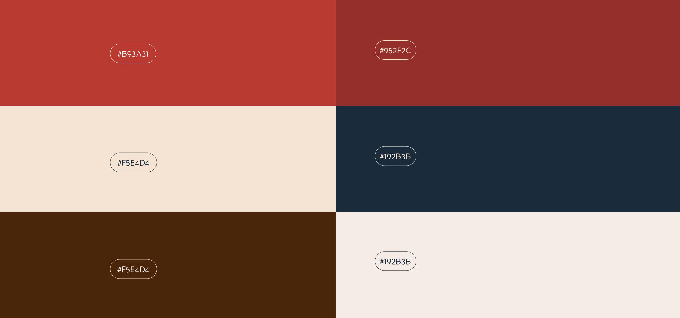
To complement the joyful new goat logo, we refreshed the color scheme and chose Volume TC as the brand’s font. Its flexibility across styles helps convey a variety of tones while maintaining a cohesive look.
Social Media
Social Media
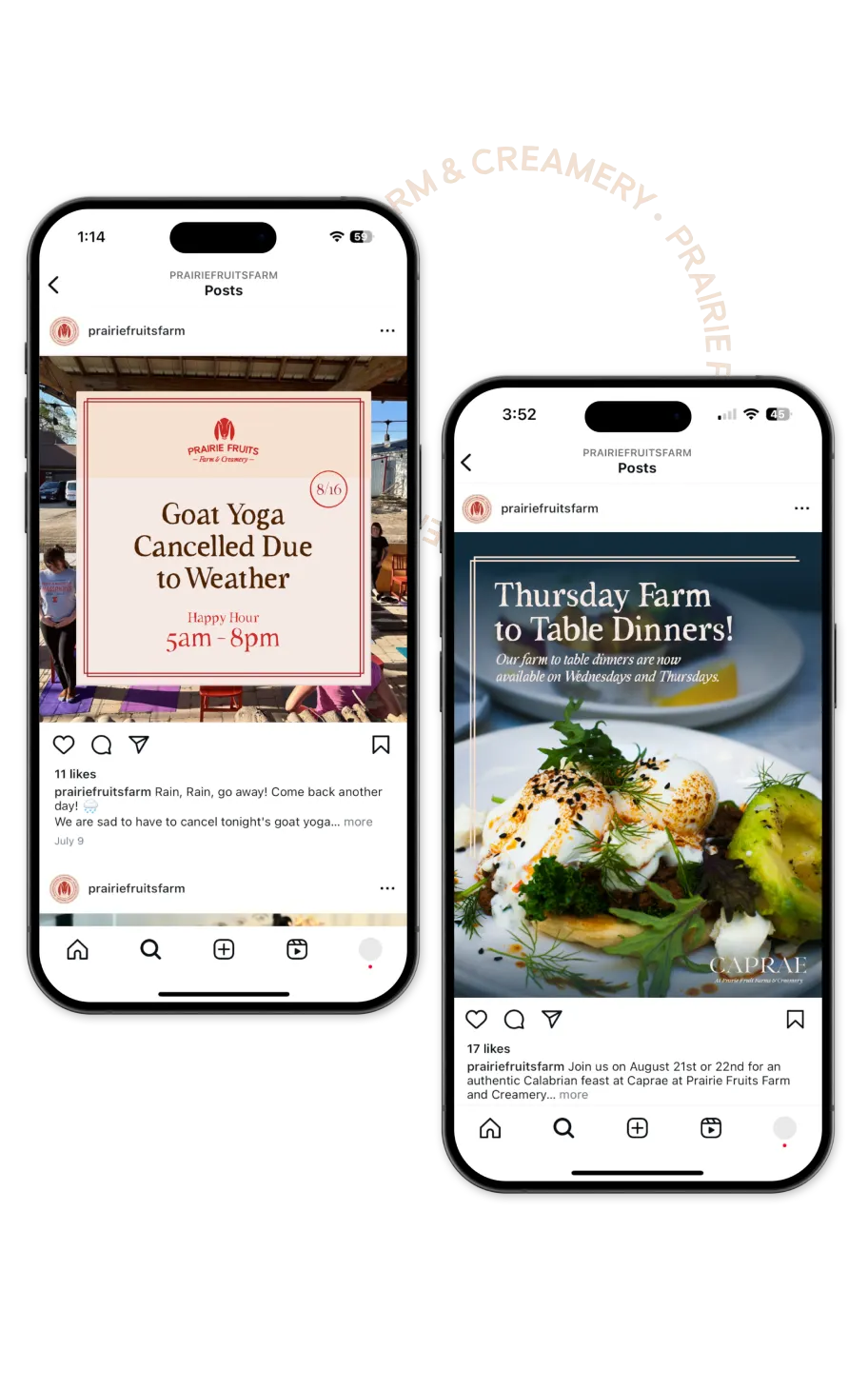
We take pride in empowering our collaborators. For this project, we developed social media templates for consistent posting and created a detailed style and brand guide to ensure clear, cohesive design across all marketing materials.
Packaging with Purpose
Packaging with Purpose
Alongside the rebrand, we were tasked with redesigning the packaging for their various cheese products. Building on their existing designs, we created a refreshed look that enhances brand recognition through consistent logo placement, trust markers, and a unified color palette—perfect for grabbing attention in grocery stores and local farmers’ markets.
Packaging with Purpose
Packaging with Purpose
Alongside the rebrand, we were tasked with redesigning the packaging for their various cheese products.
Drawing inspiration from their existing packaging, we crafted a fresh design that elevates the brand through consistent logo usage, trust markers, and a cohesive color palette—ideal for standing out in grocery stores and at local farmers’ markets.
